
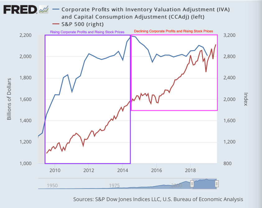
This screams bubble to me. But do other bubble indicators scream bubble as well?
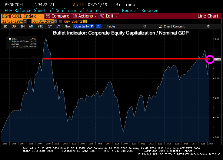
The Buffet Indicator, using the flow of funds definition of corporate equity, shows that the stock market is just below the dot.com bubble … and burst.
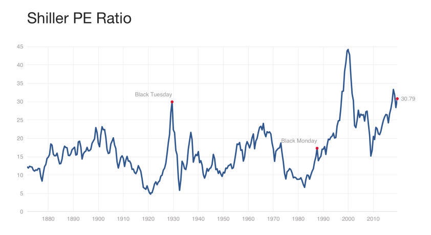
Shiller’s CAPE ratio (cyclically adjusted Price/Earnings ratio) is high by historical standards, but not even close to the dot.com bubble highs.
So, choose your poison. But all bubble indicators are at least whispering bubble, if not outright screaming it.

Join the conversation and have a little fun at Capitalstool.com. If you are a new visitor to the Stool, please register and join in! To post your observations and charts, and snide, but good-natured, comments, click here to register. Be sure to respond to the confirmation email which is sent instantly. If not in your inbox, check your spam filter.

