This is a syndicated repost published with the permission of The Baseline Scenario. To view original, click here. Opinions herein are not those of the Wall Street Examiner or Lee Adler. Reposting does not imply endorsement. The information presented is for educational or entertainment purposes and is not individual investment advice.
I still have Nate Silver in my Twitter feed, and I used to be a pretty avid basketball fan, so when I saw this I had to click through:
Just how bad were the @DetroitPistons‘ Bad Boys? http://t.co/q7A05JunDn#Detroitpic.twitter.com/SOOkfzCqq4
— FiveThirtyEight (@FiveThirtyEight) April 15, 2014
In the article, Benjamin Morris tries to analyze how “bad”* the Detroit Pistons of the late 1980s and early 1990s (Bill Laimbeer, Rick Mahorn, Dennis Rodman, etc.) were, with full 538 gusto: “That seems like just the kind of thing a data-driven operation might want to quantify.” But the attempt falls short in some telling ways.
First, Morris has to find a quantitative proxy for “badness.” He selects technical fouls. Huh?
Morris’s own sources define “badness” this way:
- “physical, defense-oriented style of play” (Wikipedia)
- “on-court mayhem” (Sports Illustrated, although in the original that’s in the same sentence as “class” and “smothering defense”)
- “gritty, hard-nosed players who didn’t back down from anyone . . . the willingness to do seemingly anything to win (ESPN)
Morris runs with that last phrase and questionably defines it as unsportsmanlike conduct (even though most people associate the will to win with, say, Michael Jordan). From there, he uses technical fouls as a measure of unsportsmanlike conduct, concluding, “this stat is the closest we have to an official determination of ‘bad’ behavior.” (Foreshadowing: sometimes close isn’t good enough.)
That’s really weak. Any basketball fan old enough will tell you that the Pistons were known for physical play, for pushing and shoving under the basket and fouling rather than giving up layups, but none of this has anything to do with technical fouls. At the end of the day, Morris uses technical fouls because he doesn’t have anything else to use. This is called looking for your keys under the lamppost, and it’s generally considered a bad empirical method.
Morris then makes his argument even more tortured by saying that unsportsmanlike conduct alone does not constitute “badness”—it has to be unsportsmanlike conduct in the pursuit of winning: “For a team to earn a nickname prominently declaring how ‘bad’ it is, the players should be using their badness to make them better.” Now, it is true that the Pistons combined a high technical foul rate with a high winning percentage. But I’m mystified at what the point is here. We already knew that the Pistons were a very, very good team—we wouldn’t be talking about them otherwise. So I’m not sure how it adds anything to the analysis at this point.
Anyway, let’s stipulate for the point of argument that unsportsmanlike conduct constitutes “badness.” Morris makes the rather dodgy assumption that technical fouls accurately measure unsportsmanlike conduct. But there are other reasons why the Pistons might have gotten a lot of technical fouls. For one, once they acquired a reputation for being “bad,” referees almost certainly looked at them differently. Players’ reputations affect the calls that referees make against them; Larry Bird could complain about a call without getting a technical, while Dennis Rodman would get one for far less. In other words, technical fouls are partially measuring perceptions of badness. This means they are pretty unreliable as a vehicle for measuring the actual badness of a team that had a reputation for it.
This is pretty basic stuff when it comes to statistics. You have to think about whether a variable is an accurate measure of some underlying characteristic. But when technical fouls are all you have to deal with, you end up ignoring this kind of issue.
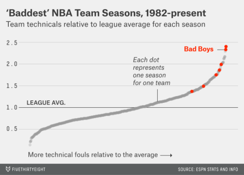
Finally, there is if not the worst chart of all time, certainly the worst chart produced by an outfit that claims to specialize in analyzing and presenting data:
The observations are individual team-years. The Y axis is the team’s technical fouls divided by the league average for that year. What’s the X axis? It says “More technical fouls relative to the average,” but that could just as well be the label for the Y axis.
I’m pretty sure that all the team-years are just arranged sequentially from left to right, from fewest relative technicals to most relative technicals. Which is a pretty unhelpful way to display this information. If you only have one dimension (number of technicals), you don’t need a chart: just say the Pistons had 7 out of the top X seasons, including the top 2, and save the ink. If you want to show the extent to which the Pistons were outliers, use a frequency distribution so we can see the mode around 1 and the Pistons out in the tail. Don’t use two dimensions to tell a one-dimensional story.
Donald Rumsfeld famously said, “You go to war with the army you have.” Well, this is what happens when you try to answer a vague and complicated question but you only have one data series—and not a particularly appropriate one.
Morris triumphantly concludes, “For once, a harder look at the data seemingly confirms rather than undermines a popular sports narrative.” I think XKCD (see the previous link) still has the last word.
* “Not bad meaning bad but bad meaning good,” that is.
![]()
Join the conversation and have a little fun at Capitalstool.com. If you are a new visitor to the Stool, please register and join in! To post your observations and charts, and snide, but good-natured, comments, click here to register. Be sure to respond to the confirmation email which is sent instantly. If not in your inbox, check your spam filter.


